Pages

Monday, November 20, 2017

Painting Falling Water

Demonstration Painting and Studies


14" x 11" Pastel of Dry Falls

This "rather long" blog post is about my love of doing subject matter in a series sometimes. I hope you enjoy the conversation and seeing a little into my days and weeks of being an artist!

Though this was a demonstration, it is "finished" because I don't want to lose the freshness of it, but not as finished as many of my paintings. It is a pastel. It was a demo for the IAPS (International Assoc. of Pastel Societies) convention this past June in Albuquerque NM.  I demonstrated for Ampersand who create the Pastelbord that I use 99% of the time and also Terry Ludwig Pastels.

Here is my recent Studio Painting!

"Dry Falls Wonder" 24" x 18" Pastel


This painting is from the same photograph, but done in the studio and has been taken a lot further with details. I still feel it retains a freshness, but with addition of other added elements. This waterfall is "Dry Falls" in North Carolina. I have painted it several times in different formats, from different angles, etc. It seems to inspire me any time I see it, or my photos!

I'm going to show you other waterfalls or cascades I have done in the past year, some are also in progress, but I love the direction they are going in.


11" x 14" Pastel Demo


The next one (to the right), also a pastel, is another demo at the above mentioned convention. And, it is the same waterfall just from a different perspective! This one is a little less finished, but I'm not sure I will do anything more to it. Again, I love the freshness of the marks.
 
Below is a 20" x 16" from near Monteagle Tennessee, and is from a photo I took in a park called "Fiery Gizzard." What a name right?

"Musical Waters" 20" x 16" Pastel
16" x 12" Pastel Demo


The one to the right is the same waterfall as above (Dry Falls again), and also was the last demonstration painting I did at the Pastel Convention in Albuquerque... I don't think this one is finished enough, so there will be some adjustments in the future!


Below is an oil painting of a waterfall in the Blue Ridge, GA area. This painting is 16"x20" and was recently in a local show, and found a new home! Thank you to the friends that purchased this one!

"Freshness" Oil 16"x20"
Be sure to check out my website for some of my "water and rock" paintings. www.marshasavage.com

Thursday, September 28, 2017

What did Matt Smith Have to Say?

Discipline! One word!


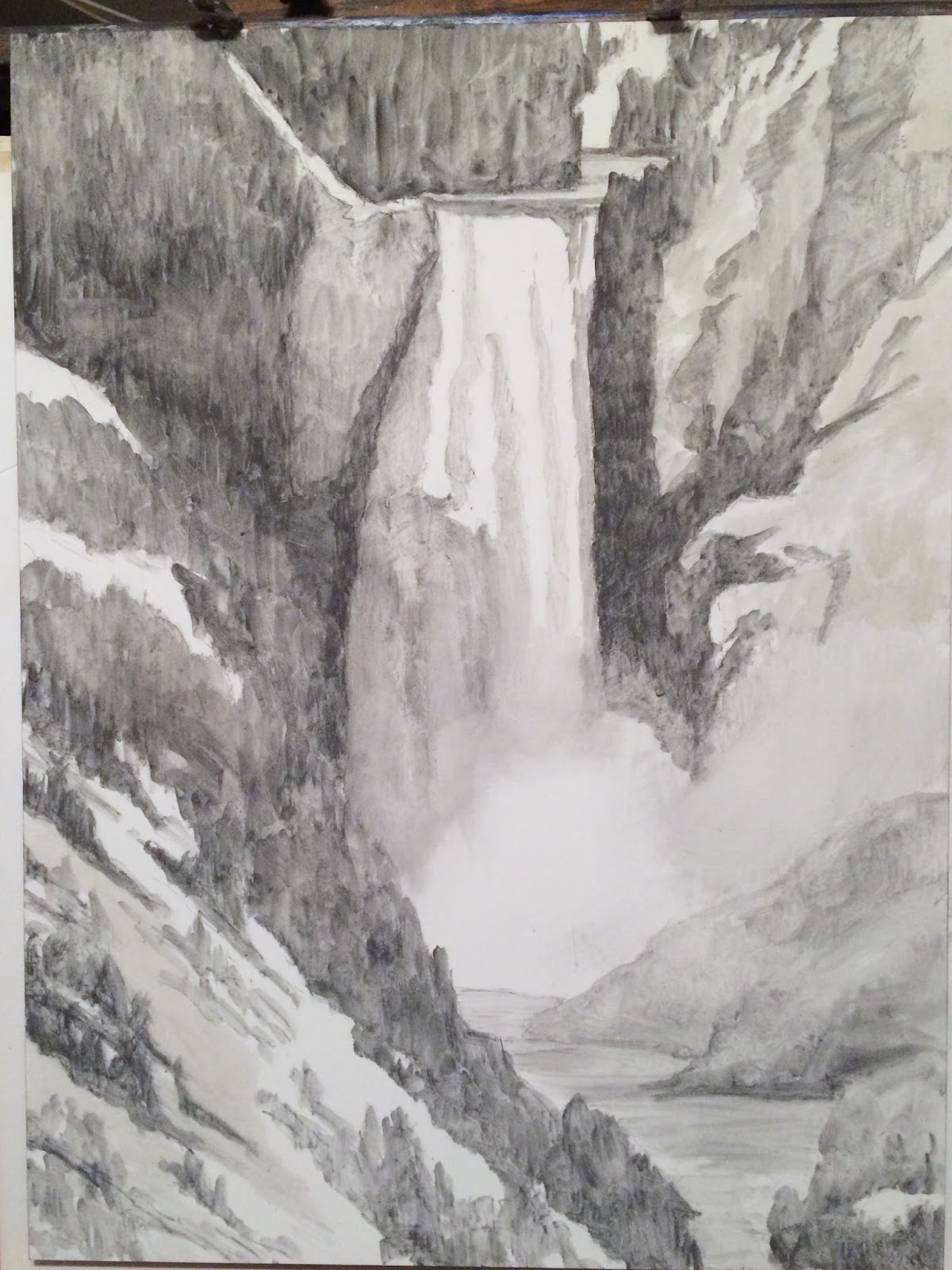
Graphite Sketch 24"x18 "Water Power"
Washed With Water! Finish Shown Below


This is a blog post I intended to finish writing over a year ago, after returning from the Plein Air Convention in Tucson AZ. The draft was still in my blog site, so I decided to finish it. It seemed appropriate for me at this time, and I thought maybe for some of my friends. And... it is a long blog post with many short thoughts he mentioned... very interesting and thought provoking ones.

Matt's first words I wrote down were: “Thin to Thick” and “Dark to Light” and “Discipline.” As a general rule this is probably the most important thing for an artist. Then he got down to talking specifics of doing a landscape. So these are little gems of wisdom. Some of them might be incomplete sentences, but they do contain those gems! All these next sentences and short paragraphs were statements he made while painting a demonstration painting. They were relevant to what he was painting, but even by themselves, with no context of a photograph of his painting, they are important things to think about. I hope you enjoy them! I know I did. It made my mind spiral to more thoughts about each one he uttered... so much so, that sometimes I missed the next sentence and I know I missed some very important words. Oh well, such is what happens when trying to write as fast as the speaker was speaking!

Identify the horizon line first. Why? It is constant. It may be obscured by trees, but be sure to identify where it is. His “horse power” is burnt sienna... his favorite color. (Look up his palette on line.) He also uses Yellow Ochre. (I might need to add this back to my palette). It is a good modifier for other colors. And, it can make a wonderful warm green with blue.

He holds his brush like a pencil instead of under the palm of his hand. At least I noticed this in the beginning.

Light references: Natural light, Direct, Reflective, Reflected blue sky light. Decide why the light is a certain one and where it is coming from. Shadows have reflective light in them. Don’t ignore this! The stronger the light source, the more reflected light you will find in the shadows.

Ultramarine blue with a cool red (alizarin crimson) for the cool shadows. Start with cool, intellectually it keeps him thinking cool in the shadows. There is “light, mid-tone & shadow.” Only temperature change will be for those background mountains. But, it still has to sit in that shadow family. He used cobalt blue saying it was easier to grey a color down. (I use this statement about greying a color down being easier than brightening one up!)

When working outdoors, an "oily medium" is not as good. There can be recurring issues....( hmmm, I wonder what that one meant. What recurring issues?)

There is pinky-violet in the lighter sections of the mountains. The Saguaro - more accents than taking over the sense of place. Use less arms!

In designing foregrounds, dirt patches, sage is a larger element. Whatever is out of harmony must go.
"Modify with the earth colors... which knocks the edge off those 'big' colors!" The "Form of the Land" is linear perspective. (I'll have to think about that one a little more.)

Viridian hue (has little thalo), puts yellow ochre or burnt sienna in it. Now the shadow side of it. think planes here, value, intensity and temperature. Hue is color: red, yellow, blue. He uses Holbein's Viridian hue. And, he uses Alizarin Crimson and Cadmium Orange to create his reds. (My thought was to take red off my palette and try this.) His only reds on his palette are Alizarin Crimson (his cool red) and Burnt Sienna (his warm red). His three primary colors are Ultramarine Blue, Cadmium Yellow Lemon, and Alizarin Crimson.

If you build structure into one thing where there are others of that element, the silhouette is recognizable on everything else. Above and beyond the subject ... the way we look at artwork in museums and galleries.

He said "Maynard Dixon --- look at his work."  Staying clean, staying structured! "Allow yourself the freedom to fail." "Follows you into the next painting and the next painting." "The painting is a living, breathing thing!" "Celebrates the organic quality instead of the thumbnail and uses his oil paint early." He said many tend to paint highlights too warm in the distance. And, if you paint the sky first, the rest of the painting will be too dark!

Back to the painting he was working on, the palo verde blooms were cool yellow mostly. And his strokes are going different ways... not all in one methodical way.

Now he knows where to add thicker paint. He uses a #2 flat... primed it with medium or solvent, to go over edges of where the sky and mountain meets. The color or value shifts to create where distant mountains go back. Study when you see it and where!

Whew! All this is my quickly taken notes... 1 1/2 years ago at that Plein Air Convention. But, I had great thoughts when reading the notebook and thought you might enjoy them even in this form.

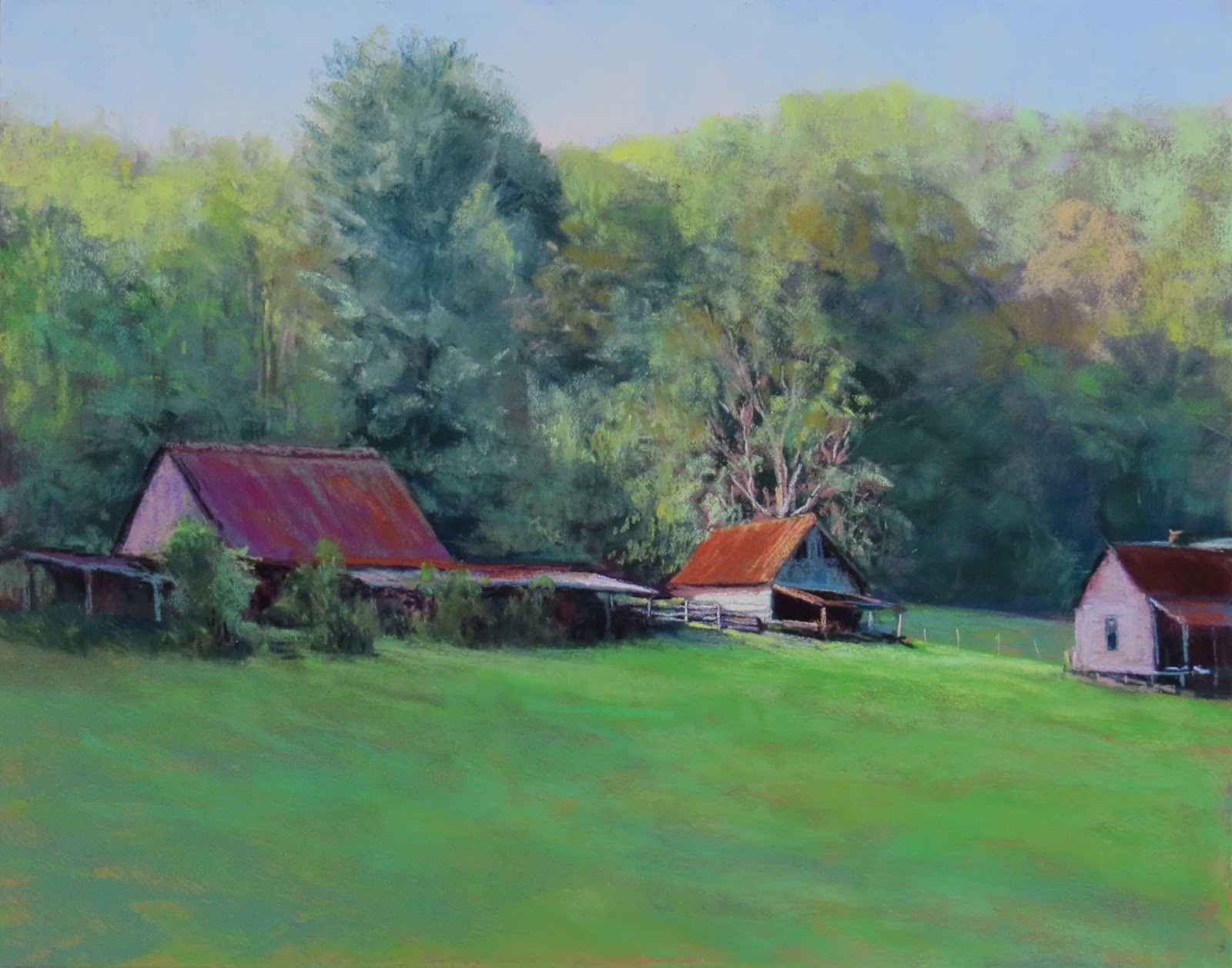
Below is my finished pastel painting of the Lower Falls at Yellowstone ... from the above drawing and wash.

"Water Power" 24" x 18" Soft Pastel Painting

Tuesday, September 12, 2017

Plein Air Festival 2017 Blue Ridge in GA

My Three Paintings in the 2017 Plein Air Festival Show
The past week from Thursday thru Sunday, I participated in the Blue Ridge Mountains Arts Association (BRMAA) Plein Air Festival. We do it the second weekend of September each year to coincide with the World Wide Paint Out sponsored by the International Plein Air Painters (IPAP). It is always so much fun, and it is not an invitational event. Our purpose is to get as many artists to participate no matter the level of their plein air experience. We believe in taking the pressure off the artists that want to learn and paint from life.
Artists filing into show to hear awards!
There were 97 paintings submitted!

There is a one-day workshop usually given on Thursday by a teaching artist. This year it was Carly Hardy, with the premise of the class being "From Plein Air to Studio." She did a great job... I took the class. I feel like you can always learn something! We created a studio piece from a previously done plein air "study."

The BRMAA sets up a "Quick Paint" usually on one of the days. This year it was Friday afternoon at the Serenberry Vineyards. Artists sign up to participate and must have their substrate stamped, and can only start when they blow the horn ... having one hour to create something ... stopping immediately when the blow the horn after that one hour. We take them to a central location and display them on small easels, and their is a judge. This year it was won by Elizabeth Carr for a sweet little watercolor. Congratulations, Betty!

1st Place, John Guernsey - Bottom left
"Toccoa River Rocks" Oil
On all days you can paint anywhere you wish within the parameters BRMAA have set. There is a bounty of beauty in this area for the artists to find many places to paint... Toccoa River, Lake Blue Ridge, Downtown Blue Ridge, Mercier Orchard, various waterfalls, rocks and water, and loads of beautiful farms and land.
2nd Place, Shane McDonald - Upper Left
"Farmstead at Old Dial and Newport Rd." Oil


I was honored to judge this show... and it was extremely hard to do because there were so many "worthy" paintings. I could have given more awards, but was limited to 1st Place, 2nd Place, 3rd Place, and one Honorable Mention. Here are photos of the winning paintings, and a few random shots of other paintings. They were taken with my cell phone, so apologies for any little inconsistencies!

3rd Place, Catherine Rich
"Chroma Flow" Oil-Bottom left
Honorable Mention, Charles Cashwell
"Mom's Place" Oil-Top


Candy Day

Camille "Candy" Day, and Ed Cahill, are fellow members of ELPA (Eastern League of Professional Artists) -  Candy's paintings to the left and Ed's here to the right. There were a couple of these that were award worthy!

Ed Cahill


More participating artists! Wish I knew the names for you. I could have given a couple of these an award!


Friday, August 25, 2017

Working in Series is fun!

"Freshness" Oil 16" x 20"
I love painting water and rocks, and trees, too. I often paint the same scene over and over again, also... but most times from a different side, perspective, in a different medium, etc. Just not the exact same painting!

Lately I have been concentrating on rocks and water, which led me to a few of my photos of waterfalls. All of a sudden it seemed I was on a roll with something that just kept speaking to me to do in oil paint, and also in soft pastels. I guess I need to also try something in acrylic. I love doing this because it teaches me so much each time I paint the similar scene, and also when working in a different medium!

The painting above started out with a pasture behind it, and an early fall dogwood which was turning ruby red. It was not working, so I scraped off some of the paint, and created a different background. The waterfall and rocks and water were working, so I was only concerned about the background becoming something restful! I think it works now... I know I am pleased enough that I will be submitting this one to a show.

"Water Power" 24"x18" Soft Pastel

Here is another one I did earlier this year. It can be seen at Frameworks Gallery in Marietta, GA. This is the majestic Lower Falls from Yellowstone Park! What a spectacular sight!

The next post will show you one waterfall where I did three demonstration paintings of it! What fun that was.

Be sure to check out my website for more paintings... mostly nature, and quite a number of rocks and water.


Monday, July 17, 2017

"To Draw Like Da Vinci"

"Roses & Blue Vase"
Graphite 20"x16"


Do you draw? Do you play? Do you make mistakes? Do you have favorite quotes?

A Couple of Favorite Quotes


To draw like Da Vinci, you need to follow his advice. “Train your visual mind to understand the shapes of forms and spaces, to recognize angles and directions of lines, to appreciate proportion, to understand perspective, to recognize gradations in tone and, above all, to be inspired by imagination. Without these, all the technical skills in the world will not produce a work of art.”

And
this one I keep by my easel!

“If you aren’t willing to make mistakes, you will never do anything creative!”

I love the first one, but the one just above is one of my favorite quotes to tell my students. It teaches me what I don’t want to do, and I remember it much better than if someone told me not to do a certain thing. Learning by making the mistake remains in the mind so much better than what someone tells you!

A pastel I brushed off part!
When working in pastel, the mistake … or let’s call it a path that I decide is not going to work … just gets brushed off with a stiff bristle brush that I cut the bristles down about halfway and at a slight angle. This leaves a ghost image but gets rid of the excess pastel on the board and allows me to add more layers of pastel. So, a little about a technique here, but this is to explain something very important about being an artist.

Being an artist is not totally about mastery of your medium. Medium means what the tools are you use to create your art. It could be anything from painting or drawing, in any of the “mediums” such as oil, acrylic, pastel, watercolor, etc. It could be that you are a sculptor, a mixed media specialist, builder of three-dimensional art, fine art craftsman building furniture or found object art … many ways of using that creative spirit of yours … being an artistic person with a vision. I believe that is being an artist! And, if we make mistakes, it is part of the process of learning, so why not embrace that part as well as all the other tools we use?

I heard a young man a few days ago mention he did art. I said, “so you are an artist?” He answered not he was not an artist. I tried to tell him that being an artist is doing something creative, no matter your level of experience. There are artists that are beginners, intermediate, advanced and professional. So if he does something creative, and he showed me a couple of his paintings, then he should say he is an artist. It would be okay to say he is a beginner … to clarify the statement.

So, make those mistakes, and try again. And, if you are doing something creative that could possibly be called art, then call yourself an artist. I do believe it might make you “own” the title and try a little harder to be an authentic you, an artist!

Friday, June 30, 2017

Being an Artist!

What is it like to be an artist?

Demonstration - IAPS Convention
Part of being an artist ... besides doing artwork ... is attending association meetings, doing research into what you want to paint (if painting is the kind of art you do), accumulating the art supplies, reading books and magazines on your art, attending workshops, conventions, etc. And, what do you do with the artwork you create? Sell it by putting it in a gallery or shows? Marketing is a large part of what you do if you are selling. If it is a hobby, then you are probably giving them to friends and family.

I am in the process of writing a book about "Being an Artist" ... which is my working title. So the ideal of what it is like to be an artist is the gist of the book. I hope to address many of the issues of the life of an artist, not necessarily techniques for painting, but the day to day things we deal with. There is such a misconception about being an artist and how carefree we are. I probably work well over 40 hours a week doing what I do for my art. Yes, our schedule can be flexible, but if not careful, your time gets frittered away before you know it. Respect for what we do, and thinking of it as a job.... yes a pleasurable one ... is a key element in being successful.

So this is just a small snippet of some of what will be in the book. This post is about the most recent attendance at the pastel convention known as IAPS! 

The beginning of the above waterfall! 14"x11"

Attending the IAPS Convention!

This June 2017, my husband and I went to the IAPS convention (International Assoc. of Pastel Societies) in Albuquerque NM. I think this was my eighth convention for IAPS. We love going and Haywood helps out in the Terry Ludwig Pastel booth in the vendor market... so he keeps occupied while I do my networking (meeting with my friends) and demonstrations in the vendor market for Terry Ludwig and Ampersand Pastelbords. In years past, I would go to different sessions, so it was a good thing he was occupied and not just bored and sitting around waiting on me. 

Above you can see the waterfall painting the way it was when I stopped. And, you can see the small number of pastels in the Strada Easel, that I used for the painting. The photograph is in the upper right, but has a glare on it. 

I probably won't do anything more to this painting.... it has charm just the way I left it! And, to the left you can see how I started the laying in of pastel on a grey Ampersand Pastelbord. You can see the simplicity of the dark and light pattern to the painting... which is a wonderful way to see if the composition will work out well.

I was at the Ampersand booth demonstrating the use of their boards! I did this for the three days of the convention's vendor market. I also had on a Terry Ludwig apron, and talked a lot to attendees about the use of his pastels as well as the boards. His booth, a double booth, was just a couple away from me. 

I did four more demonstration paintings over the three days, but I think I'll break up this post into a couple more so it won't become so long. Here is an image of just this painting as I stopped that day.


How I stopped for the day!


Sunday, June 25, 2017

What is it like to be an Artist?

Maybe Being Able to Paint a Meaningful Painting!


"Not Enough Green!" Pastel 16"x12"
The post title, "What is it like to be an Artist?" could have so many different answers. To me it is the joy I feel when I can produce something that is worthy of a frame, and truly means something to me and maybe to someone else. It means there is joy in the viewing of the painting by others! The painting I am showing at the top is one of those.

A Little History


I started painting ... or I should say, learning to paint ... 45 years ago with oil paint. My Mother brought me her tubes of oil paint from when she painted, and that was when I was a baby. I had just given birth to my daughter several months before and was staying home to raise her. Mom thought I needed something to do! Was she kidding? I had a newborn and had loads of stuff to do!

Well, anyway, that is the start of me trying to paint. And, I had a best friend that was painting and taking lessons, so she encouraged me to do the same. I did find a lady that gave lessons at her home about twice a month on a Tuesday (I think) evening. I probably took about 6 months worth. She had us painting from her own paintings. But, she did allow me after the first one to paint from a photograph I had found in an inspirational publication. I still have that first and second painting, and I am rather proud of what I was able to do!

Along the way my Mom brought me a set of pastels ... Rembrandt .... that she found at a yard sale. Wow, all those colors, and so quick to use. Again, I was off on another adventure. I think that event came about 2 or 3 years after she brought me her oil paint tubes. I also took only two workshops and no other lessons for about 25 of those first years. Both of those were 5-day plein air workshops, one in oil paint, and one in acrylic.

Fast Forward Many Years!


I painted my little heart out and learned loads of stuff from doing so, and from voracious reading of art books, magazines and studying other artists. I made loads of mistakes along the way, but those taught me what not to do. And, it gave me permission to keep trying different techniques, different mediums, and I made lots of artist friends that helped me along the way.

I started framing some work, showing in a couple of local small gallery/frame shops, and started selling about 10 years into my journey. Ah! Reminds me of my favorite saying... "It's the journey, not the destination!" But, I digress. I decided to join the Atlanta Art Center, took on a few volunteer jobs and kept learning. Nineteen years ago, I took my next workshop from a legend in the Atlanta area, Elsie Dresch. This was a pastel workshop, and I took everything she said to heart, and my work seemed to just take off. Elsie, my first mentor, is the one of the reasons I really fell in love with pastels.

But, you know how opportunity comes knocking loudly sometimes? Around that time I started teaching workshops and lessons. I was being asked to teach some of my friends, so I thought it would be a good thing to do. And it kept me learning so I could keep ahead of my students, right? I participated on a website called "WetCanvas" and meet many wonderful giving artists there! One of those made the most important impact on me, my art and my career!

Now We Get to the Answer for the Above Painting!


The person in this painting is truly like no other artist I have met. The plot thickens ... he was on that website, and I had participated for awhile in conversations on the forums about pastels, painting and teaching. He got in touch with me and said something to the effect of, "I know you are teaching classes and workshops, so would you like some samples of my pastels?" Well... that wonderful man was the master colorologist, Terry Ludwig! My answer? Of course, it was a resounding yes. I had heard of his pastels.

Not long after, not to bore you with all the history of it, he came to visit me in the Atlanta area to teach a portrait workshop at the Atlanta Artist Center. Since he was staying with me, we went out to paint plein air, and it being an August morning, it was humid.... and very green! I came around the barn and took this photo, as he was painting. It was a wonderful memory and  I have wanted to paint it for years. I had it taped to one of my cabinets for that eventuality. I did so just a few months ago finally. I framed it and carried it with me to the IAPS (International Association of Pastel Societies) Convention in Albuquerque NM this month (June, 2017). The Terry Ludwig "candy store" booth had it hanging behind the workers that helped attendees pick pastels to purchase and take home with them.

I  painted this memory for Terry and his wife, Marie... and it is now hanging in their living room as a gift from me. We create joy when we paint, and some of the best memories when painting, learning, teaching, visiting galleries and museums, attending events, and best of all ... making artist friends! All these things are joyful if you let them be.

Wednesday, January 18, 2017

Doldrums? Need to Change?

"Healing Waters" Pastel 14" x 11"

Here are a few items you might want to try!


I was reading a blog post by John Weiss that are along the lines I am discussing here about making a change. He gave a list like I have below, but I made my own list with the help of his. And, in the article, he also said, "The question is, must art become commercially successful and widely recognized to be powerful? To fulfill the artist's creative vision? To elicit joy in others? .... Doing the work is enough." I did leave out some of what he said before that last sentence because what I read spoke to me just the way I have presented it here to you.

Make sure to listen to your heart! Change should only be about a passion or an intriguing idea that just won't go away. This might be a great clue as to a direction worth exploring.

So.... what should you do?


1. Identify why you feel you are stymied or need something new, or you are stuck in the doldrums.

2. Visualize what could be .... what intrigues you.

3. Write down your thoughts, or what you would like to change. Do some research into the things you are thinking need work.

4. Make a list of steps that might help you accomplish the change you wish to make. Have a plan of study, or practice... which helps you figure out where to go.

5. Create some reminders of what you want to accomplish .... your goal. Stick them up where you will see them every day. Practice with purpose these things that are change or different from your normal way.

6. And maybe you need to change your routine so it will be easier to not fall back on your old methods. Move your supplies, have a different order, change the supplies, put on different music.... anything that will signify something new is about to happen!

Remember ... you might encounter these types of feelings, or the need to change something, many different times during your lifetime or career. This is normal and a realization that it is time for growth or learning something new! You can't grow if you keep doing the same thing all the time.

Farm On a Hill (working title) Pastel 11"x14"
 I have a quote taped up right beside my easel which says, "If you're not prepared to be wrong, you'll never come up with anything creative!" I think about it more now that I see this quote beside me. It helps!

The two paintings in this blog are part of my change from the past three or four years of trying to "simplify" which really led me down a road that was not working for me. So, part of my change was going back to who I really am, and what I love to paint ... use what I have learned in those years to make my work better!

So ..... sometimes change might be revisiting who you really are, using things you have learned, and understanding what "success" means to you.