Pages

Tuesday, June 25, 2013

Who Likes Paintings of Western Scenes?

We just returned from a trip to Albuquerque for the IAPS convention (International Association of Pastel Societies)... driving out from the Atlanta area. And, I took many photos and painted on location in a few places ... so the question is what to do with those paintings and the ones to come in the studio? I am looking for the best way to find potential clients ... especially here in our Eastern states!

The sightseeing part of the trip

This is quite a long post ... I thought many of the photos quite interesting. Our first stop for the night was Little Rock AR ...
Somewhere in Arkansas
Again, Arkansas
driving to Elk City OK ...
On the road .. cloudy!
Flat land and cows!
After the tornado!
thru Texas ...
prairie and small arroyo!
Dropping down toward plains and more prairie
to Santa Rosa NM ...
The Pecos River
The Mission in Puerto de Luna and
Billy the Kid played around here!
On now to Santa Fe NM...
Haywood going up Canyon Road
in Santa Fe for a few galleries!
Meyer Gallery at Canyon Road, and
Kent Lovelace is a favorite of mine!
 and then to Albuquerque ... 
Old Town Albuquerque...
Fantastic place to visit!

We left Albuquerque after the convention, on our way to the Denver CO area, Littleton to be exact ... for me to teach a workshop at the Terry Ludwig Pastels shop.... and drove the High Road to visit Taos NM for a couple of days ...
We kept getting closer to one of the fires
above Santa Fe ... but skirted it!
One valley high up in the high desert!

Just before we started the last part
of the drive down to Taos.
We stayed at a fantastic Bed & Breakfast in Taos and visited the Rio Grande Gorge just out of town...
 
After a long walk from the bridge,
what a view back toward it!
And another view from the bridge
.... and then the ride through northern NM and southern CO to Littleton. When we left Littleton after the workshop which was very successful (and another blog post), we drove I-70 East through Colorado and Kansas to Kansas City area for the night. Then one more day and night into Arkansas to Jonesboro AR. The next day it was to our home... going from Jonesboro AR, through Memphis TN, Mississippi, Alabama into the Atlanta GA area. Whew ... three days and two nights from Denver CO to Smyrna GA!

Monday, May 6, 2013

Pastels or Oils?

Which type of painting do you prefer? Pastels or Oil?

I paint in both of these mediums ... and sometimes in acrylic. I have experimented with watercolor, but it has a different process than the other three... it is from light to dark, where the other three are dark to light ... for the most part!

Oak in Oil
24" x 18"
The painting shown here on the right is the second painting of this tree ... I did a pastel first from a digitized version of the photo and a black and white thumbnail to determine the light and dark abstract pattern. This version was done from the same resource material without the pastel painting being in the room. I did not want to just copy the first pastel version into an oil version.

Here is the soft pastel version:
"Water Oak"
Pastel 16" x 12"


What is Pastel?


Remember when I talk about "pastel" I am not talking about the colors... I am talking about a "soft pastel" stick of pigment. It is sometimes called "chalk" but it does not have chalk in it. These pastel paintings must be framed behind glass.

There are some galleries that will not carry pastels or watercolors ... because they are behind glass. I do think the attitude is changing in some places, though.

I normally frame my pastel paintings with Museum Glass which has a 98 or 99% UV rating to protect the pastel from fading. Even so, most pastel work will not fade unless you really have left it with very bright sunshine on it for a long time. The main reason I use the Museum Glass is for the non-reflective quality of it. When you walk in a room, you don't even realize there is glass on the painting. It does help! And, I very rarely use mats anymore... all they do is catch pastel dust on them and after a time look rather dingy near the bottom of the framing.

One thing for you to know ... I price my pastel paintings and my oil paintings the same for the same sizes... I believe it does not matter which I paint in... I love them both!

Question for you ...

Do you have a preference? If so, what and why? I would love to hear from artists and from collectors.


Wednesday, March 13, 2013

Who is Marsha Hamby Savage?

Who do you think I am?

I have been thinking about what is it that I like to paint? Is there a particular subject matter, or colors, or techniques that show up all the time in my paintings? Is it about emotion, or a story, or is it about my decision to keep on learning something new? Where do I see myself going and why? What is it I want to do?
The start of an Idea!
A good friend asked me that last question on the way to the airport after I had spent a week with her. Can you imagine this question early in the morning? This is the tough question ... what is it I want to do?

My Answer:

I want to continue to paint! I want to travel and teach .... which means I need to make enough money to continue to do that. Travel fills up my well of experience and is where I go to capture an idea for painting ... even if it is just a few miles from my home. Painting plein air (in the open air / outdoors from life) is my classroom and where I learn the most. Teaching is one of the things that helps me keep learning more about what I do ... besides the added benefit of seeing students learn and that "light bulb" go off when they finally understand a concept they have been trying to internalize for months or years!

What do I want to paint? Anything that has to do with how light affects the landscape. That said, I also enjoy occasionally painting flowers, still life, and people.
The Underpainting
Here is my favorite subject matter ... trees! I don't think anyone will be surprised by that comment. I do mostly enjoy painting the landscape with no hint of "man" or "manmade" objects. Another favorite is the landscape with a stream and rocks, or a pathway or road (I know, manmade!), where there is a bend or curve, and some suspense as to what is around the bend... where you wonder about what can't you see. I want the viewer to participate in the painting ... to put themselves in the scene, or know they have been there, or want to go there!

This painting is a 16" x 12" pastel on Ampersand Pastelbord... which is my favorite surface to do a pastel painting on.

In progress with pastel added
I have finished the painting, and have now started a 36" x 24" oil painting of the same scene to see how it translates to the oil medium and what I do differently using the oils and a brush versus a stick of pastel in my hand.

Finished ... "Water Oak"


This particular thought process has made me think more about what I want to teach also! Most students tell me they want to learn ... of course ... but the main thing that drew them to my class is my use of color. I love exploring different colors to help with the use of "local color". So ... I will be including in my classes and workshops how you will choose color to fit your own emotional responses and personal choices and likes. 

My personal colors ... green (of course) and turquoise with the addition of purples, reds and oranges... any variation of these colors also! Can you see they are relatively opposites on the color wheel? Makes for some very interesting combinations! 

Wednesday, February 20, 2013

Color and Trees Can Be Fun If You Let Them

I am relatively known for my use of color and for my paintings of trees. ... quite often people will contact me and tell me they enjoy seeing my website, my Facebook posting, or my blog because they enjoy the trees and also how much they enjoy my use of color.

So, when I felt in a little slump a few months ago, my answer for that was to just paint paintings of trees, or with many trees in them... and experiement somewhat with my colors.

Oh, What to Do?

I was really frustrated, and decided I needed to do something to make it more fun. I pulled out some plein air pieces and a couple of studio paintings that I had put aside until I could figure out whether to completely brush them off and start over, or brush parts off and try to salvage something from the original idea.

Here are a couple of things I have done. Now remember, I am showing you some, in my opinion, failed tree paintings and then what I am doing to it or with it. And, I might not be finished with some in the second incarnation! And so far, I am working on pastels in this correction mode! I do have one large oil painting I might do another post about.

Here is the first one ... think about what you like or don't like, and how would you correct this one. Really study ... it takes some time to analyze.

Callaway Gardens
Plein Air 16"x20" Pastel
Here is the start of what
is a renewal hopefully.


So, even though I have changed quite a bit about this plein air painting ... making it a studio painting ... there is more work to do. I have made a few subtle changes from the second image above. The next image shows it as it stands today waiting for a final assessment. Any changes are a little difficult to see here, but ... maybe you can.


So, color to me is a little more emotional than what I see in reality. I want to create a mood, a story, a viewer participation in my work. On my Facebook page I posted a bit about not using gray or brown ... I purposely look at any color that can be classified either brown or gray and think to myself, which color does it lean toward ... like gray ... can be blue-gray, pink-gray, green-gray, etc. The same can be said of brown ... which to me is a warm dark orange muted color. That doesn't mean it is always! It might have green ... as in muted olive green mixed with the red/orange to create the "muddy" brown color!

Do you see these nuances of brown or gray in my painting? Do you see what many might consider unreal colors? Does the color I have chosen lend itself to a more emotional intepretation of the scene?

I would love to hear from you ... Enjoy the process I am using to learn more about color and hopefully make this into a frameable painting!

Wednesday, January 2, 2013

Wouldn't You Like To Learn Something Better?

White Pine Light
Pastel 14" x 11"
I will be making a change in my Open Studio Sessions here at my home studio. I think we need a better plan for what we will work on each day that is planned.

I have been in a little slump with my own work and trying to figure out how to raise the level of what I love to paint ... trees and the landscape around them. So, my first week of Open Session Days will be about trees... both Tuesday and Wednesday. This way, if you are only a "Tuesday" person, or a "Wednesday" person, you still have the opportunity to work on trees!
Cool Sumac
Oil 11" x 14"

I will be looking at plein air paintings I have done, photographs I have taken, sketches I have done on location, or thumbnails for previous paintings. These should give me some ideas for planning a new painting .... and I will be more thoughtful, slower to put brush or pastel stick to the board. I will paint with a purpose, know what I want to do, and proceed from there. If you plan to attend, you need to bring photos you have taken of trees, plein air pieces, or I will also have photos. And, if you have a piece you are working on that is about trees, you can bring that.
Parks Vista
Oil Plein Air 12" x 9"

The first week the dates will be

Tues. & Wed., Jan. 8 & 9 

.... you should be ready to jump in and paint by then!


I will be structuring my Open Studio Sessions on Tuesday and Wednesday for January and February. I hope one of these days each week can work for you! Remember the time is from 10:00 until 4:00 or any portion of that time. Cost is $25 per day. Here are the remaining dates:

McCarthy Dogwoods Turning
Oil Plein Air 11" x 14"


Tuesday and Wednesday, Jan. 15 & 16
Tuesday and Wednesday, Jan. 22 & 23
Tuesday and Wednesday, Jan. 29 & 30
Tuesday and Wednesday, Feb. 5 & 6
Tuesday and Wednesday, Feb. 12 & 13


Cypress Evening
Pastel 12" x 9"
Come join me and explore trees and all the beautiful negative spaces created by this magnificent part of our landscape! 
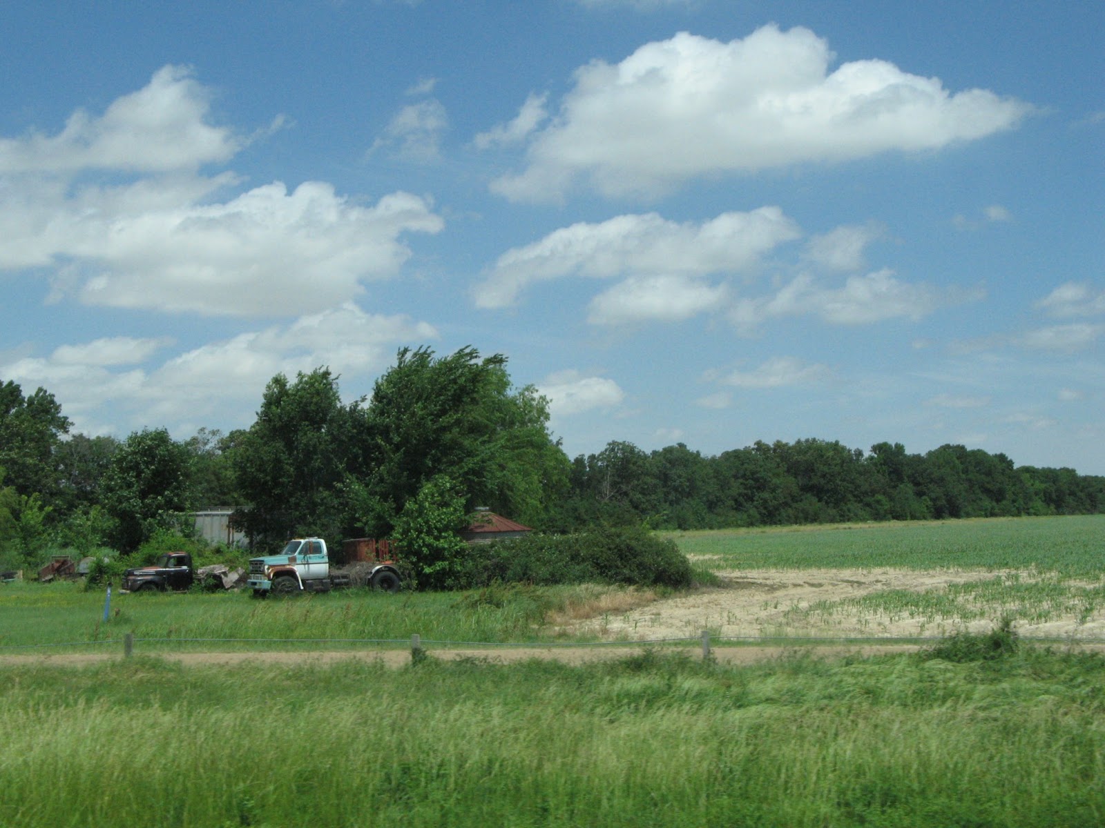
Roadside Beauty
Oil 24" x 18"


Send me an e-mail if you need more information:
 marshasavageart@yahoo.com .