Pages

Saturday, September 17, 2016

Rocks Are Fun To Paint!


River Run, Pastel 20"x16"


Painting with pastels is so much fun with rocks. You get to choose a stick of pastel and make a beautiful angular shaped stroke... and that first stroke just looks like a rock! How cool is that? Use that broad side of the pastel stick. I break all my pastels in half and it is just the right size to make that mark.

Beginning Shapes


My Method of Breaking the Shapes Down:
  1. Be sure to squint to look at your reference so you can see the dark and the light shapes of the large mass of rocks. When you open your eyes, quickly think: "Is the dark a warm or cool dark?" This will help you decide to use that temperature when you pick your dark color. This means the light rocks will be the opposite temperature. So, if you decide the dark is warm, then the light part of the rock will be cool, and vice versa! Does that make sense?
  2. Break the large shape of all the rocks down into a dark mass with no reference to small rocks, just the large dark shape. Choose a dark pastel that is a couple of values lighter than black... this could be referenced as a "middle" dark. Stroke it on the complete dark shape, lightly caressing it on the surface.
  3. This leaves the part of the large shape of all the rocks that you have determined is the light mass. So, choose a light pastel that is a couple of values from white... this would be referenced as a "middle" light. Now, you can caress that shape with this lighter pastel on your surface.
  4. Make sure you have touched the dark mass to the light mass, and by this I mean don't leave the surface showing to create a "halo" effect around or between your dark and your light. You want them butted up against each other. If you leave the surface showing, you have in essence a third value!
At this point, you can use a wet under-painting method if you wish, or you can leave it dry. It really does not matter, and is only a personal preference. Sometimes I do one, and others I don't.

The Second Layer of Pastels

As you start layering other pastel colors onto those first two, the dark and the light, you will start breaking down the large mass of each. Important point to remember at this stage is to not introduce anything from the light half of the value scale into your dark area, or dark into your light area. You have four values you can use from each half of the value scale, saving the lightest light and the darkest dark for the end as your accent and highlight marks. And, make sure you use that pastel stick in such a way as to look like the angles in rocks... no potatoes please! :)

 Here is my progression of these rocks:

Breaking up the Light Shape

Breaking up the Dark Shape


I have added details to the dark shapes with warms and cools, but with all those being in the dark half of the value scale. This gives interest to the rocks without making them look too spotty... and of course the same thing was done with the light shapes. All of my marks until the end, are done with a "light hand" instead of a heavy-handed stroke. This is just me. Play around with different pressures of making your mark. Find what works best for you. Sometimes it will be light, and sometimes heavy as the "feeling" of what you want to give the viewer will come through. Also make sure some marks are larger, some middle and smaller and move in different directions or angles. Variety is what we see in rocks!

Adjusting the Greenery and
Creating Interest in the Rock


To make it look three-dimensional, I have made sure the part of the rock moving down and inward under the bottom is a little darker, but never as dark as black. The same has been done for the top of the rocks... highlights on a few as if the sun was just touching it. Remember too, the light of the sky will reflect onto the top and make it a little lighter than the angled sides of the rocks.

"River Run" won an Honorable Mention at the Southeastern Pastel Society's International Juried Exhibition this past Spring. It will be one of my paintings available at Taylor-Brawner "Park With Art Exhibition" in Smyrna GA. The event will run from Friday, Oct. 7th through Sun., Oct. 16th at Smyrna's historic Taylor-Brawner House. The exhibit will be open 6 - 9 pm on Friday for a Reception and meet the artists. The show will be open daily thereafter from 12 noon - 5 pm. On Tues. and Thurs. (11th and 13th) the time is extended to 8 pm.

Come see me at the Reception!


Sunday, July 24, 2016

Creating From Your Memories

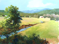
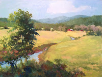
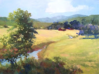
Valley (in progress name) 24"x30"
As it is before fresh eyes this morning!


There are many times I have a vision of a scene I want to create. I will go through some photos and plein air pieces to come up with some references that I can use to jog my memory. Crazy right? Well, this painting has been worked on for about three different days, with some days where I did not get to work. I have posted a few of the "in progress" shots on Instagram which then gets shared to my Facebook page. Several have made comments, and when I posted the first stage (which is coming up) I was asked to please show the progress shots. I will say there was a stage I was working on in the ravine/creek area that did not get a photo, before I scraped it out and stopped for the day to come back the next one and start again.

The beginning shots of laying in the idea! 


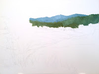
Step #1
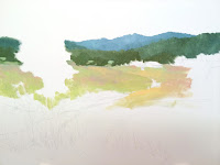
Step #2
Step #1 drawing with pencil very lightly to give me a road map. And then a start with the distant plane... the mountains!

Step #2 Here I am adding colors in the pasture, creating the negative image of a tree, combining peach and ochre mixtures with light green mixture, so I could have a pasture with "character" and not a flat color.

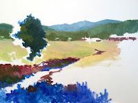
Step #3 I have just moved down the canvas getting a layer of some colors and values and shapes. This helped create the stream bed, a slight ravine and the bushy stuff at the bottom... and the dark side of the tree.

Step #3
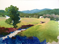
Step #4

I like using Ultramarine Blue and Permanent Alizarin Crimson as underpainting colors for my darks. The green tree actually started out with the Ultramarine Blue as its under color.

Step #4 I continue adding the pasture colors, and more greens into it as it progresses forward. My greens are a combination of Ultramarine Blue and either Cad. Yellow Med. or Cadmium Lemon. I adjust those, adding some modifying colors to knock them down a little. I'm also beginning to play with what are the trees and stuff coming toward us from the background. I introduced some trees that have a lavender in them... could be trees that are losing their foliage for some reason.
Step #5

Step #5 is trying to cover all the white of the canvas except the little barn in the distant middle ground. I added the sky colors, leaving a light section to become a cloud, and also put that sky color in the creek. I have the bank of "Georgia red clay" on the shadow side of the creek... a small ravine. And, I have added more to the tree and little bush, foreground foliage values and colors.

Step #6
Step #7 - grey scale
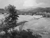
Step #6 This is the image after I had scraped off lots of "nit-picky" foliage in the ravine area of the creek. I had spent a lot of time on creating what you see growing down in those little creeks that snake their way through a pasture. Well, I didn't like it, so I used my palette knife and scraped! This is the image after that, but I have added more color to the little barn, and changed some of the colors in the pasture. I have also changed the distant course of the creek and the near part as it comes to the foreground foliage. And here, on the right, Step #7 is a grey scale ... values only with no color.

Step #8
Step #8 Here I have scraped out the middle distance... the barn and trees... adding the barn a little more forward and just slightly larger, and creating a bank of darker blue to build some trees on behind the barn. The right side I have changed those lavender trees to a larger shape and a little more forward. 

Step #9
Step #9 ... here I have added the colors to the trees behind the barn, worked on the pasture, and am changing the shape and direction of the creek again! And, I have moved the tree from the bottom on this side of the creek to the other bank... other side of the creek.

When you are not pleased, be fearless and make a change, even a significant change. I have developed a work method of "thinking" this is only me trying to learn, be a better more thoughtful painter even when deciding to scrap off! Why am I scraping off? Make decisions based on your knowledge when you are backed away and sitting on your stool. A mentor of mine, Duane Wakeham, ld me I needed to spend more time sitting on the stool, and a little less time painting... he knew I am prolific!

It still does not please me... so, Step #10, I have added to the middle trees, putting shadows under them, etc. I have changed the creek bank more, and worked in the foreground. So here is another photo after reading this long post and looking at all the progress shots... of the image at the top... where it stands as of writing this post. That does not mean I won't change it when I make it back to the studio this afternoon, or tomorrow.

Step #10
I hope you have enjoyed coming along with me on this journey of starting, changing, working, changing, and hopefully getting toward the end of a 24"x30" oil painting! Work some from your memory, have things sitting around that will inspire you, things that will give you ideas, etc. But, be creative and unafraid! One of my favorite sayings is, "Crash and Burn" if you need to do so. You might not be glad you did.


Sunday, June 12, 2016

Why change an older painting?

Peace In the Valley, Oil 36"x48" painted in 2011
Sometimes we paint a piece of artwork that we love most aspects of, and decide it is a finished piece. I am a firm believer that paintings are really never finished, we just decide it is the best we can do at this time in our career. When trying to decide if it is finished, I always say:

"When you are backing away to make your decisions, be thoughtful. If you don't know anything more to do, that would make it perceptibly better, then don't do anything."

The painting above was painted in 2011, and is a 36"x48" oil on a gallery wrap canvas. I was trying to convey a morning with the sun low in the sky and reflecting on those clouds and the land and trees. This painting has been in my gallery in Marietta, GA, Frameworks Gallery, for most of that time. They have moved it around, placing it in many premier spots in the gallery and always getting good comments and rave reviews. But, it just had not met it's owner yet. I brought it home last week, and decided to work on it to see how I could improve on it. You know, we keep learning, and refining our thoughts on how best to present a feeling in a painting. So I stood and thought about what kind of feeling did I want to change this one to?

Bottom of the painting redone

My first thought was change some of the colors in the field to a more traditional green, and then maybe with highlights of taller grasses in the middle ground ... those we see that have seed heads on them making the color a little more on the neutral side, or maybe on a light warm beige or wheat color. These could have bits of peach or pink in them... along with a light green. This was something I was seeing in my mind's eye.  I knew it needed something else! I also wanted to lead the viewer into the painting... so next thought, "how about a pathway or road!"

The top third of the painting with cloud changed
And, if I am changing the colors of the land, then I need to change the colors showing in the cloud to be consistent with the colors of the land. The light will still be morning light and low in the sky. But, I'm not sure this is the finish of the clouds... I need to refine the shape of the cloud. Right now it does not look believable to me.

The middle third of the painting still needs work!

And, the middle portion of the painting might need some color changes too. It is still a little too yellow for my taste. The middle and distant grasses of the painting have been changed a couple of times. Mix a little different color for that distance, and make sure as I change that cloud, the land mass reflects the same kind of light.

But, do be aware that my grasses aren't that yellow, and greens in the trees are not really the color you are seeing, but much darker. I do think the photo is not showing correctly... the grasses in the distance are more yellow in the photo. This photo of the total painting was done inside even though I changed the color cast in Photoshop Elements to be more natural, and less like the yellow light we find inside. The final one will be done in natural light outdoors and the colors will be more true.

The redo as it stands from last week's work... ready to start again!

Still some sitting on my stool and thinking about what do I want to convey, and how best to do so. Wish me luck!

Saturday, May 14, 2016

Third and Last Day of Marketing Boot Camp

Eric painting at Old Tucson
Monday morning was the last day of our Marketing boot camp at 6:30 am! So glad, those long days were killer! This is going to be a long blog post. And I am going to sprinkle it with some of my work, because there were shots of his slides, but I think you need what he said instead of just those "dry" lists!

Eric started with something to the effect of "you've been marketing and maybe had a little success ... now what?

His reply to his own comment was "don't go into coast mode." This is something that happens to many artists... success can lead to some sitting back and then you lose momentum. So, to get back on track he said you need to ask yourself some probing questions such as: "What was making me successful?" But, also, you don't need to just keep on doing the same thing. A good strategy is to keep reinventing yourself. You need to eradicate the concept of the starving artists. Many artists fall into this trap of believing it is true.
"Dunes Tree" Oil 5"x7"

And, sometimes you need to keep the perception of being the "Best" and help others believe it. I took this as a don't make comments that undermine what others think of you or your work. Be positive, and you don't have to share the down side to some of the life of being an artist, or even the parts of your painting you are not so thrilled with.

After this pep talk, he started talking about a new plan he has. It is a 12-Month Marketing Plan in a box which he is selling. I believe you can order this plan, so check out the Plein Air Convention site.

Things an Artist Needs to Do!
Two words he used were "Discover" and "Imagine" as important steps in creating a plan.He wanted to know, are you sick of the income roller coaster? The client is a key element. You can increase their lifetime spending by switching the mind-set from a one-time buyer to a continuous lifetime client. This can create cash windfalls as needed, or a cash surge. The plan is you need to invent something for that cash surge... so his "Imagine" was a key to doing this.

"One and done doesn't work!" He said you should lay it out for the year. And, no negative thinking. He wants you to ask, "how can I make this work for me?"

There are "five reasons for failure." (1) Not really being in touch with customers, not understanding them, (2) no market differentiation - you need to stand out. Don't use the same old photos of just paintings, but think of things that are a little different. Show yourself in your studio painting, or on location painting. Show your tools and discuss them, (3) failure to communicate clearly - make sure terms are understandable, (4) there is a breakdown at the top, in the leadership, and (5) an inability to have a profitable business model with proven revenue streams.

"Cypress Dance" Pastel 24"x20

And, "why do you need this?" So you can have (1) predictable income, (2) freedom and flexibility, and (3) a big advantage. What you would get in this marketing plan in a box: Monthly Components, Weekly Components, Twice a Year Components, and Quarterly Components. This plan is more "what to do vs how to do it." You get guidance, discovery, a marketing calendar, and components of what goes on the calendar, listing every strategy you plan to use (advertising, social media, and notes. You will assign dates, assign duties, monthly and weekly. This really was a sales pitch for the plan, but if you listened closely, there were jewels of ideas on how to do it if you were organized and motivated. Many artists are not! They want someone else to do it for them. This was a compromise.

He did offer many slides of the parts of the "marketing in a box" that were teasers. It did make me think about "do I want to buy this?" I decided I am pretty good most times at marketing, but I am not consistent enough. It just made me want to become more consistent and do it myself. I want to be as he said "market differentiation - stand out" .... be different. I didn't want my plans to be just like the ones that would purchase his plan. I'm sure it is a good one and will work for those artists that follow through and do it just as he has it laid out. And, you do get 4 phone calls, he called them "implementation calls" with Eric and his crew. Here is a shot of the screen that tells all you get in the box.

The list of what is in the box

The system components


Here are some of the points you can do yourself. Eric talked about how to get back to direct mail as it still produces. We don't need to just rely on the internet for email, social media and newsletters. Create something that is different, have a theme, stand out. Even do a "killer offer". Don't forget to have great "killer" Headlines... very important to grab their attention. The mistakes made are (1) not having a "call to action" (2) nothing to differentiate you, and (3) not having a deadline. The offer needs bullet points, a great name, a hot title, to pull them in. Draw them in by using the entertainment factor.

Have something special for your clients, offer a deal that is more social, have a reception or small dinner, a small private cocktail party, give them a small gift such as a print (the $5.00 type). The client needs to receive this offer by direct mail, using a nice oversized post card with good graphics, too. A great headline, bullet points, the offer, and a deadline to respond (the call to action). Show your artwork in small images somewhere. Here is one of my paintings I like to use when putting on a card. It always sparks interest and questions!

"Willeo Park Misty" Plein air pastel, 16"x20"
He did a quick run-through of images showing lists that talked about quarterly components, twice yearly, micro newsletters, refer a friend programs, phone calls, personal visits, deals with your gallery. Talk about your integrity. Having a system to remind them to buy! Have a lost customer reactivation plan.

He said the #1 rule ... the key to crushing it ... don't always make an offer, but when you do, they can't refuse. Identify what's in it for them, describe it clearly, add scarcity, add a bonus, and describe the call to action ... but not in a sleazy sounding way! He commented how do you get this going fast? Spend 2 days thinking, then 2 days creating your theme, create templates you can use, etc. This is designed for local strategy, but may be used nationally. Offer something and get people excited about it. Pick one thing! Make it entertaining and exciting. Stand out!
"My Ride to Work" Pastel 16"x12"


My take-away from this third session ....


Keep a marketing calendar, 12 month one, put dates on it for each thing you are going to do. Have someone you can use as an accountability partner. And then use it! Show your clients you care. Know them, and know what can work for you. Make it as easy as possible to keep going on your plan and don't make it overwhelming.


Saturday, May 7, 2016

Marketing Boot Camp - Day Two

Eric and Stuart Johnson

Whew, another very early morning, alarm goes off in enough time to take a quick shower, put on clothes and makeup, make it to food court, and eat something, drink coffee... hurry, hurry! We did get a little better seat, actually the front row!

In our seats before 6:30 am and ready to pay attention to Eric Rhodes second day of Marketing Boot Camp. Today Eric spoke first about being in, or getting in, galleries.
View of cactus, homes, and mountain
from the back side of El Conquistador Resort

Eric had Stuart Johnson, of Settler's West Gallery, on the stage to give advice from the gallery owner’s perspective. We took copious notes, and photos of things he posted on the screen so we didn't have to try to write so fast! Very interesting conversation so that it might help those that were looking to be in a gallery, and how the gallery wanted to be approached and dealt with if you were taken into it.

View the opposite way of the mountains
Art being created of these
views behind the resort!
If someone is referring you to them, he takes into consideration where the information is coming from. When someone mentions you name, same thing, where the information is coming from! 


Important Career Advice

- Know what the market needs, and for advice about
         raising prices (and when).
- They can build a collector base
Saguaro and artists on the golf green!
- They may be observing you unknowingly.
- Establish a relationship before it is needed.
 - Get invited in
- Do your homework.
- Understand who your collector is.
- Are you a good fit for the gallery.
- Do you know any of the artists
      ... They might introduce you!

 What is at the top of his list of most important?

Mr. Johnson said the number one thing they look for is consistency! The body of work is important along with a certain amount of available inventory. But he cautioned about producing “too much material” and thinks it is a detriment to your career! Over 40/50 finished pieces is not good probably. It intrigues collectors as well as the gallery... Scarcity is sometimes the key.

As an artist grows, you start competing only with yourself. ... and this is how you get invited. Be visible! He advised artists to focus, but be broad enough -- fresh -- in your concepts. Staying in the same genre is mostly what is considered acceptable.

He gave advice on pricing ... and about increasing the prices only gradually. Sometimes the prices are too low and can turn off a collector. Lower price points are for people decorating their home.

Prickly pear ... what i wanted to paint.


So now you are new in the gallery
... what now?

- Be open for some criticism. A good critic.
- The gallery introduces the artist to the public, maybe other shows.
- Be ready early – work ahead!

Mr. Johnson said: The Kiss of Death! Sending a painting that has been in another show! Older dated paintings. Missing deadlines more than a day or two.

Palo Verde tree blooms!


Here are some random thoughts, or answers to questions asked at the end of his part:
1. Story of the painting... titles should be better. So what was going on when doing it!
2. Galleries should allow us the name and address of client purchasing a painting so we can send a thank you handwritten note.
3. Out of sight, out of mind
4. On plein air, need to do studio work as well.
5. Size? How important? The larger it gets, the more difficult it is to sell. There should be a variety of sizes in your repertoire.
6. In his gallery, there is a lowest price point of a few under $1,000, and he has a few at the highest price point, with many that are in the middle.

I hope you are enjoying the notes I took during the Boot Camp discussions. Do know there was probably much more that I missed and spoke to someone else at a different place in their career. I will be working on the notes from Day 3 over the next few days!


Saturday, April 30, 2016

Marketing Boot Camp Day One

The scene from our Walkway

My Study of the Scene, Pastel 12"x9"
Marketing Boot Camp was for three mornings, in your seat before 6:30 am! We had time to get in line for a Starbucks coffee and pastry... but luckily, there was instant Quaker oatmeal, so I had that for breakfast that first morning. The next two mornings, the convention had breakfast for us in the Vendor Expo, eggs done like a folded omelet you could eat with your hands, oatmeal if you wanted that, and coffee!

So, I am going to do several blog posts with more information than I can put in a Facebook post. I had several people ask me if I would do this. Here is the first marketing boot camp information as I wrote notes... so there will be quotes from Eric Rhodes and Lee Milteer. It might not have a "story" type of progression, because I think the things I wrote were what I "needed" to write down for me to remember.

Eric Rhodes - first!

Creating people that follow you and become clients is more about Persuasion instead of Manipulation. You need to think of it as helping someone obtain something they need. So persuade! He says momentum builds repetition, or vice versa. Without marketing, nothing happens. It should be an ongoing part of the artist lifestyle...and that repetition builds trust, and trust is brand! A strong brand will overcome most things. Keep the momentum, and be inventive!

Also, you should never be boring, it should be about emotion. If you are boring you probably will lose 20% of your followers per year. To help with this start with the outcome in mind first. Know who buys your work, know the pattern of their purchases.

He also mentioned "The Grand View" by Stephan Baumann... I think this is a video that should be watched. I'll have to look it up and see.

Lee Milteer - "The Impact of Your Mind"

She wrote "Reclaim the Magic," just one of eleven books. She is also an artist, and was attending the Convention as an artist. When Eric saw she was attending, he decided to have her be one of his presenters for the Marketing Boot Camp. She was very inspirational.

Some of her first words were: "you need a marketing mindset," "no one will take care of you," and "Don't think like everyone else!" I loved this last one. Be different in some way, and be personal and authentic.

There are "Five Kinds of Energy" that should be used everyday! (1) Mental (2) Physical (3) Emotional (4) Spiritual and (5) Financial. Here are a few of her quotes also: "Art stimulates massive creativity", "Match with their needs!", "And so it was!"
Artists in the Vendor Expo!

Be interviewed. When she was, she realized that the medial needed her. They were looking for a good story. Find local and national press. Court and woo them. Have tickler files about yourself or ideas for stories. Write letters to them. Use anything previously written about you ... especially previous articles. Be a celebrity in your own area. If you have articles, the media has already christened you. Use this to your advantage.

"Scripting" ... write up your ideas and thoughts by hand. This can be a form of goal setting, helping you with goal setting. We are deliberate creators! Use it. Talk about how your art business exploded. Use the recognition you have attained. Talk about your house, your studio, your inspiration. Be personal and let them inside who you are. Be interesting.

Help change your references. In your subconscious, in your brain. You are your references. Use your "intentions" to match a new reference. "Manifesting - Intentions" "Trigger to the World" These can be self-fulfilling prophecies. Have no more negative thoughts. When you do, use the word, "Cancel" and then you say, "That is not like me." This is an intuitive basis for the new references. Have a new "positive thought."

"Conscious languaging!"  "The word is power" ... and "Try" is a disempowering thought. Don't use the word "try," use words such as "I will!" So example is something like, "I will try to do more marketing." Not good. Use "I will do more marketing." Just leaving out the word "try" will help you make a positive move.

Maybe call colleges to look for interns in marketing. Have them help you create a video with a one-page sheet with bullet points about who you are.

"What we imagine becomes real!" Use this thought process for 3 minutes in the morning, and 3 minutes before bedtime. Use a notebook to write your deepest dreams in. This is taking action astrologically. Make 2016 a break-through year.
Tom Christopher also on the balcony
when I was doing my study above!

FEAR ... Fantasy Experiences Appearing Real!

Stay in contact with your friends and clients. Handwritten notes are better than email. They are a personal thing and helps your contacts feel you are more sincere. Add photos in them. By doing this you are a little more aggressive, and leveraging your skills.

"Final thought" ... "Your point of power in this life is right now! Focus turns into direction."
She mentioned going to a site: "fivetypesofenergy.com" ... do this. Share it with your children and grandchildren. It applies to all walks of life.

----- I have pretty much written the above with just mostly the notes I took, making them into sentences. I only added a few things about some of them from what I remembered, or to make them a little more clear. I hope they are not too disjointed, and can give you some ideas of your own how to motivate yourself in what you need to do.


Tuesday, April 26, 2016

My Trip Out to Tucson

Picachio Peak State Park near Tucson
Pastel Plein Air 9"x12"
Karen Margulis and I drove together from our homes in Smyrna and Marietta GA to the 2016 Plein Air Convention in Tucson AZ, and also taught a 3-day plein air pastel workshop in Dripping Springs TX on the way out. We were gone a total of seventeen (17) days on this trip. Hectic? Definitely! Fun? You bet! I am going to break this in several posts about various parts of this awesome trip and so I can show quite a few of the photos.

I picked Karen up on Wednesday evening and we made it to Biloxi MS for the first night's stay at about midnight Georgia time! We rose early the next morning for a 9-hour drive to Dripping Springs TX. We were able to explore the locations of our workshop on that Friday, have lunch, and I visited with a long-time artist friend in Wimberley TX and see his gallery. If you are ever in Wimberley, visit "Art on 12" gallery and ask to see Bob and Zeina Cook! They would love to show you around this wonderful gallery.

View of the front of the gallery
The wall with Bob Cook Art!
Dinner just down from the gallery, and a band!
Here are a few photos of the locations we would be teaching on Saturday, Sunday and Monday along with some of the students.

The scene at Mt. Gainor Inn where I did a demonstration
Driving to Mt. Gainor Inn, there were cows
so interested in us taking photos of them.
We had lunch at Salt Lick Barbecue,
where we would have lunch the third day
and hold a "sharing and Q&A session!"

At each of the locations for the workshop, we had a plan for a short demo in the morning by one of us, and the other would do a short demo after lunch. The students had close to two hours after each demo to work on something while we gave advice to each individually at their easel. On the last day, we each did about a 30-minute demonstration on a very specific element of the landscape... something the students might have expressed more information on. Karen did one with clouds, and mine was about trees and sky holes! The students had time to paint before lunch, and then we closed with a question and answer with each student about their experience with the workshop, what they learned, and the goals they had for the workshop.


Charro Ranch Park would be Day Two!
Fall Creek Winery was Day Three, with Karen Margulis
and our hostess, Marsha Young

Students Love Bluebonnets!
I will pick up the thread of the trip in a few days and give you more! We had a fantastic time, talked loads, and laughed a lot! We are better artists for our time together, the team-teaching of the "Two Wandering Artists," and learning and painting at the Plein Air Convention!